Customer service starts way before shoppers contact you directly, and that is something every brand should take into consideration. In fact, if you do it right, you may never have to open another email with questions that you’ve already answered dozens of times before. This will lead to higher customer satisfaction and reduced support queries.
One of the ways to achieve this is by creating an informative FAQ page on your store. Not only can it help to reduce customer support time, but also boost your customer experience, thus resulting in a sale or two.
An FAQ page template is no less important than the information you provide there since it’s what makes it easy for shoppers to find the answers they need. Well, either easy or complicated, if done wrong.This article will guide you through the key points of choosing an FAQ page template for your online store and showcase some of the best FAQ examples to give you a little nudge to improve (or even start building) your own.
What is an FAQ page?
To those of you who are not familiar with the term, FAQ page, or Frequently Asked Questions, is a page on your website that contains the most common questions your visitors and customers are asking about your products, services, or the company in general.
There are several significant benefits of adding an FAQ page to your store:
📍 A well-made FAQ page can save your customers some precious time by enabling them to quickly find answers to their questions in one place.
📍 FAQ page eliminates the need for customers to get in touch with your customer support team – win-win!
📍 It allows you to show your expertise and brand personality.
📍 It helps to build trust with your audience.
📍 FAQ pages help to improve SEO (meaning you’ll be able to rank higher in search results).
📍 Providing instant answers can improve your sales.
How to add an FAQ page on Shopify?
FAQ pages are not a part of Shopify stores by default. If you want to add one to your Shopify store, you have two options:
- Create it manually using the Pages section of your Shopify admin
- Go to the Shopify app store and install one of the third-party apps, like HelpCenter
Both options are not that difficult to implement. However, compared to Shopify FAQ builder apps, that are developed for this exact purpose, the first option might require you to have a little more time on your hands.
Shopify apps also offer more freedom, from choosing how your questions and answers will be displayed to customization of the ready-made templates.
The right FAQ template and an option to organize and customize it based on your needs will help you align your Frequently Asked Questions page with your brand look and feel, make it easy to navigate, and look more professional in the eyes of your visitors.
For this, Shopify apps are simply more flexible.


What do great FAQ templates have in common?
Let’s cut to the chase here - FAQ page design plays a huge role in customer experience. Therefore, selecting a template is an important decision that can either help you grow or leave your customers confused and disappointed.
What to consider when choosing an FAQ template for your online store? Check out some key components of a great FAQ page below.
Clear structure
Writing informative answers is very significant, but what also matters is how you present that information to your store visitors. What’s the point of having an FAQ section if it’s messy and barely possible to use?
So when selecting an FAQ template, make sure it allows you to build a clear layout. Your questions should be categorized and put into sections that contain specific articles, making the page easier to navigate.
To avoid clutter, there are FAQ templates that offer different ways of organizing questions, for instance, “accordions.” This structure highlights significant details of a section and usually reveals the information upon a click. Therefore, users can easily find and access only the information they need without wandering around your FAQ page for too long.
Search bar
Most often, users who enter your FAQ page already have a specific question in mind. Instead of scanning the categories and sections, a lot of people prefer to simply type their questions into the search bar, and that’s why it’s a must for any FAQ page.
Search bars can also suggest related keywords, providing a learning opportunity to the visitors.
Contact form
In case your visitors can’t find the answers they’re looking for or want to learn more, make sure your FAQ page also contains a contact form. Add it at the bottom of your FAQ page as well as include it within each article.
This way, if there's anything left to ask, site visitors will have quick access to your contact information and won't even have to search for it. Not only will it be of extra help, but also show that you care about their experience.
Mobile-responsive design
M-commerce is rapidly growing, which means that many people are already using their mobile devices to shop or, at least, do their research.
If a mobile-friendly e-commerce store is a no-brainer anymore, your FAQ page should be no different. It's often one of the first customer touchpoints with your brand, and making it easy to navigate is crucial for the best experience.
So make sure the FAQ template (and your whole page, actually) is mobile-friendly, since a possibility to browse and find answers without zooming in and out can encourage a sale.
5 FAQ examples from famous brands for inspiration
Let's look at how businesses use these features to make the best out of their FAQ pages.
Below you will find 5 FAQ examples from famous brands that will likely inspire you to rethink your FAQ page design or, if you haven’t done it yet, add an FAQ to your store.
1. Twitter
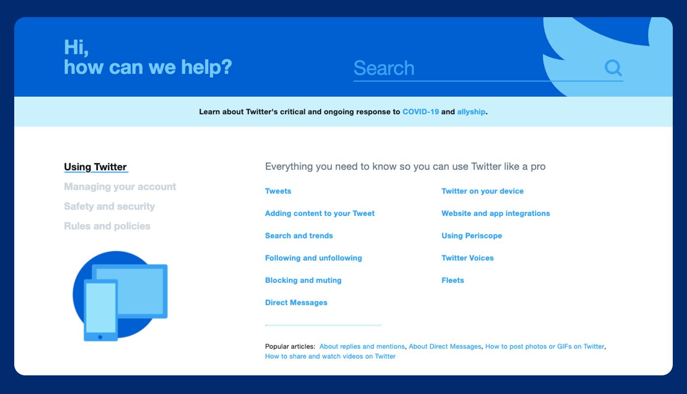
Twitter’s FAQ section is highly structured and very intuitive. Even if you don’t really know the exact problem, Twitter has done a great job collecting (and even predicting) frequently asked questions and grouping them into categories and sections for an effortless browse.
Although his FAQ section covers tons of useful information, the page doesn’t make you feel overwhelmed. It all comes down to four main categories: using Twitter, managing your account, safety and security, and rules and policies. Each of them is divided into smaller, very specific sections that, once clicked, bring the user to relevant articles, covering everything from how to tweet to safety and security issues.
2. Wikipedia
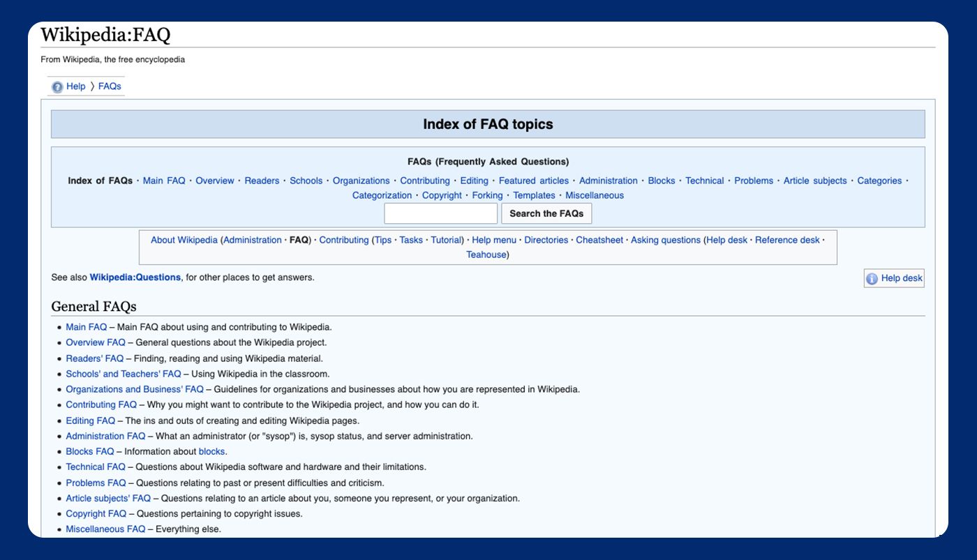
Wikipedia’s example is great for two reasons.
First, Wikipedia too has put a lot of thought into the structure of its FAQ page. The topics are categorized into general frequently asked questions, specific questions, and other relevant information that might be useful for Wikipedia’s users. Each section comes with a short description so that the visitors would know what exactly does it cover.
Once you open a section you’re interested in, Wikipedia brings you to a new page that looks like any other article written on the website. That’s another reason why this template is great – it maintains Wikipedia’s brand voice. Users don’t have to spend more time familiarizing themselves with the structure. They are already familiar with it, and this is what makes it extra easy to find answers to their questions.
3. Airbnb
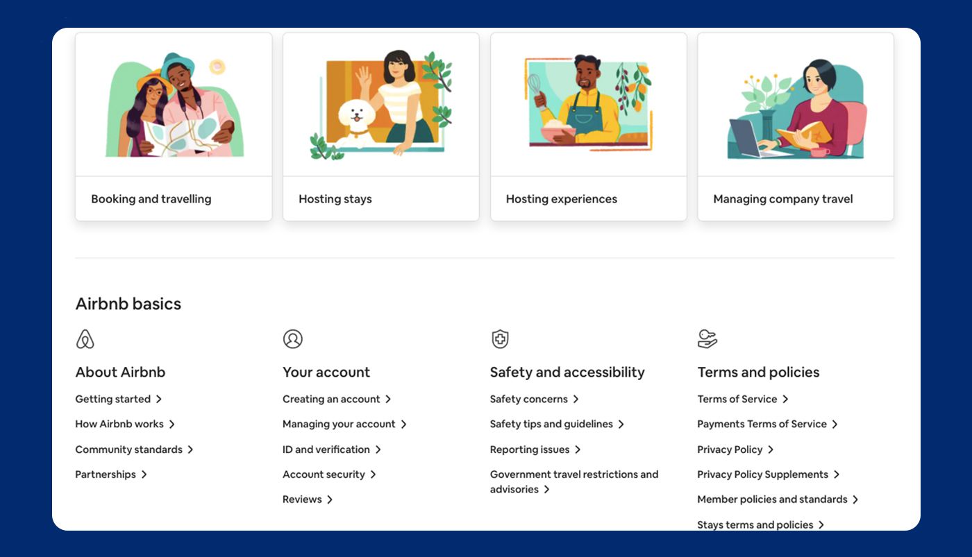
The thing that first catches your eye when you open Airbnb’s support page is a clean, minimalist design that actually feels very well-thought-out despite how simple it is. At the top of the page, you can use a search bar to find help articles faster, or you can even log in to get personalized support.
If you’re up for checking the categories, Airbnb offers to read popular articles first in case you encounter a similar problem. The illustrations below highlight other topics that likely contain the "most-wanted" frequently asked questions, such as booking and traveling. The last section of the page is dedicated to technical things and general information, like managing your account, how Airbnb works, community standards, and so on.
So that’s another feature of a great FAQ template – starting with the most important or the most relevant information for the users, and Airbnb has definitely succeeded in achieving this.
4. Netflix
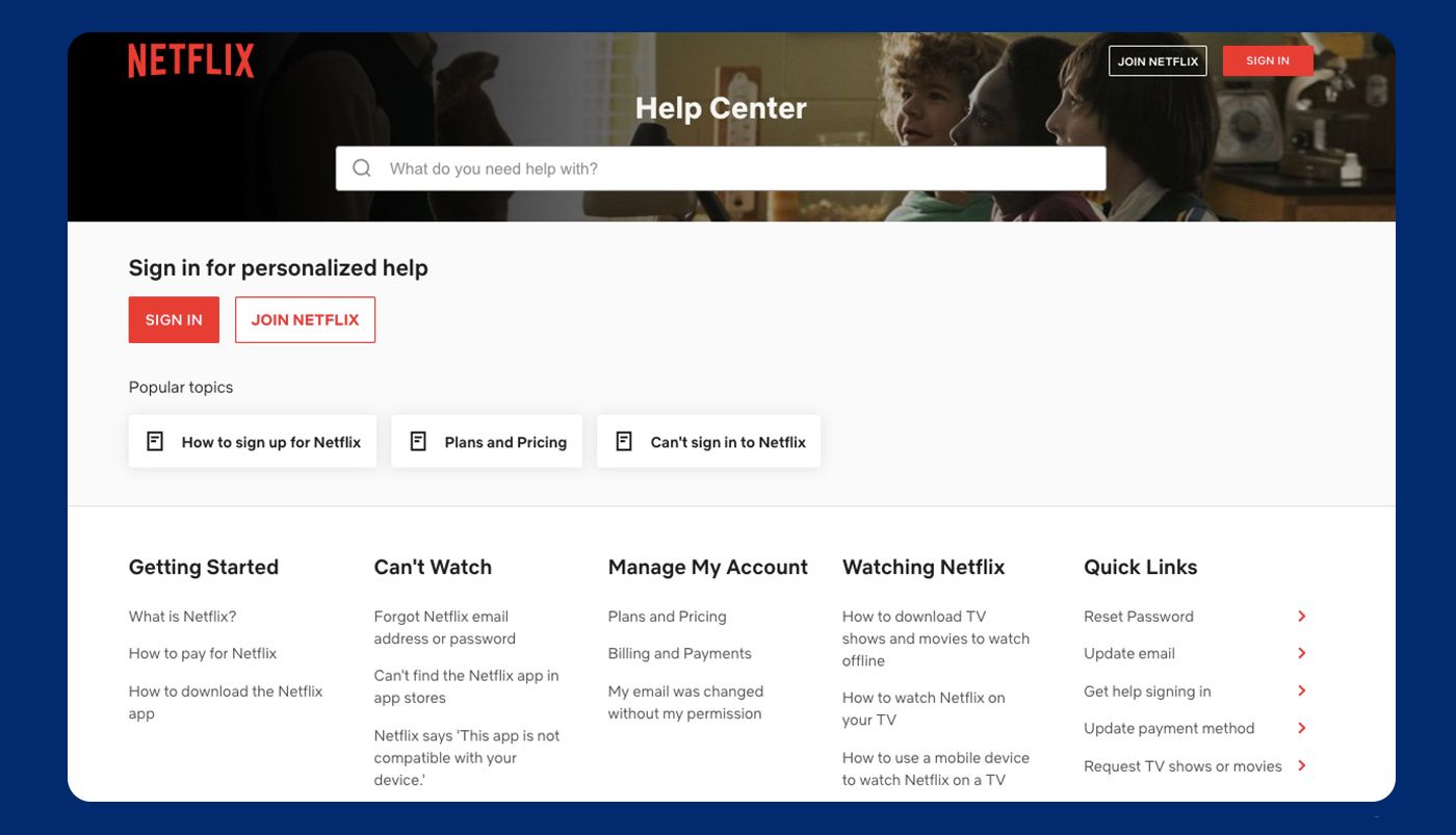
What’s different about the Netflix FAQ section is that it greets users with a search bar that’s centered at the top of the page. That's a rather simple but smart design decision that encourages site visitors to use the search feature instead of switching between categories to find the information they need.
As well as previously mentioned Airbnb, Netflix also uses a similar approach. First, it offers to sign in for personalized support, and just after that highlights a few popular topics that might be of your interest, before guiding visitors through different categories.
5. Microsoft
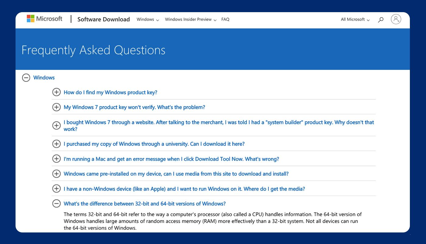
Microsoft uses an accordion template that expands once the visitor chooses a specific category. At first, you can only see two categories based on their two products - “Windows” and “Office,” and you can pick one of them to avoid digging into the articles that you have no interest in.
Such templates are especially convenient for mobile users as they don't have to scroll that much and can access information faster. Microsoft implemented the easiest possible layout Q&A style, and that seems to be working just perfectly.
Polish your FAQ page for a better customer experience
Crafting an effective FAQ page requires preparation – collecting frequently asked questions, writing informative answers, categorizing them, deciding on a clear page structure that would make it easy to navigate... And all this while keeping the visual appeal in mind.
This is where FAQ templates can take the burden off your shoulders. But before choosing one, make sure to go through the key points of a great FAQ page template again and draw inspiration from the ones that do it right to make it work for your business.


